A dramatic interpretation created with Chicago Pride.
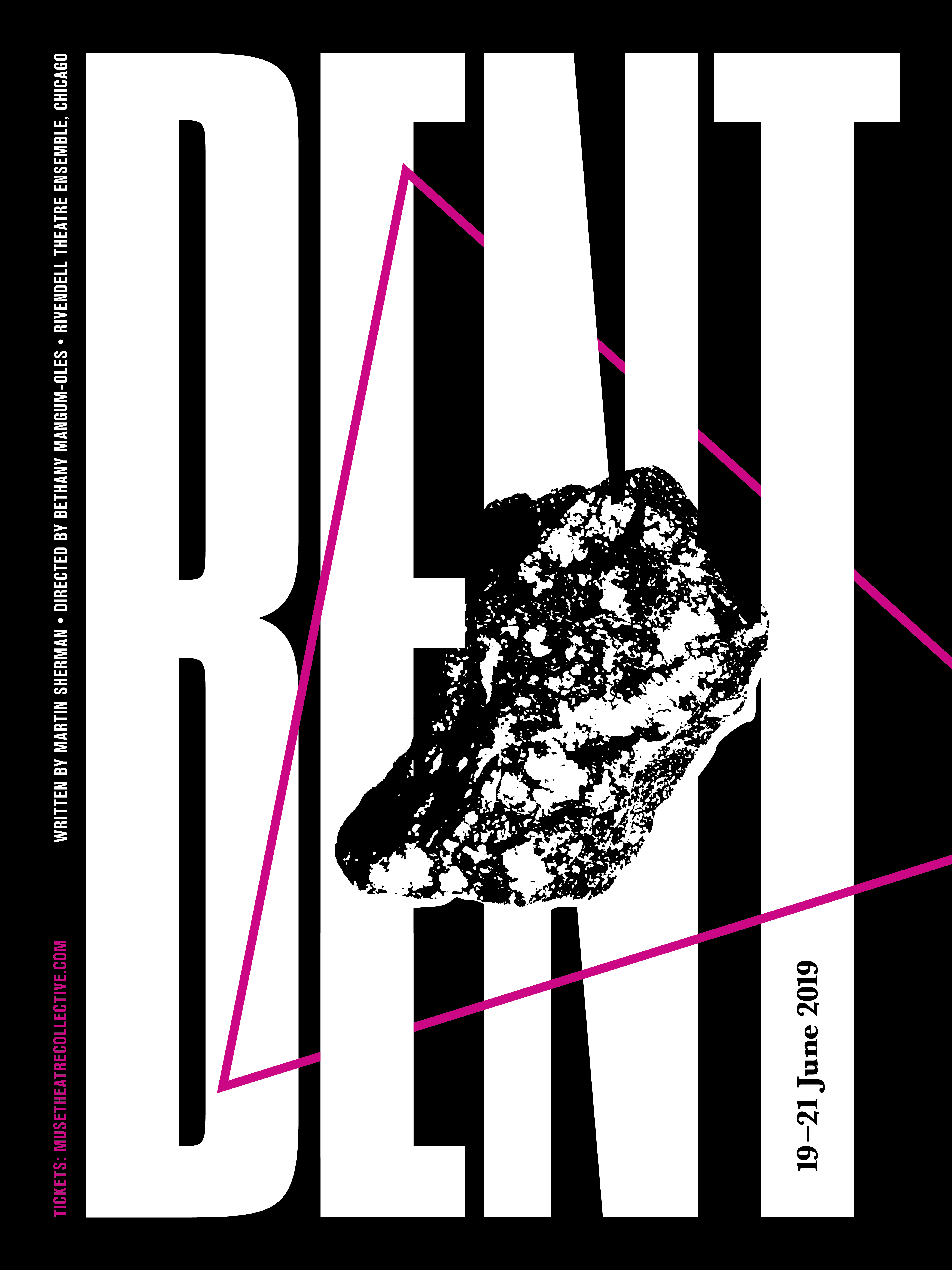
Promotional poster created for Muse Theatre Collective and their presentation of BENT by Martin Sherman during the 2019 Chicago Pride month.
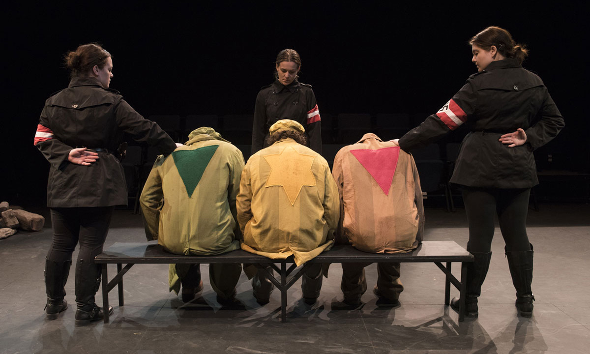
This work interprets the Nazi criminalization of homosexual men (marked by pink triangles) following their arrest and internment in concentration work camps—exposing an often unknown layer of Nazi intolerance. These men were interned prior to the Jews and often imprisoned beyond the liberation of concentration camps.
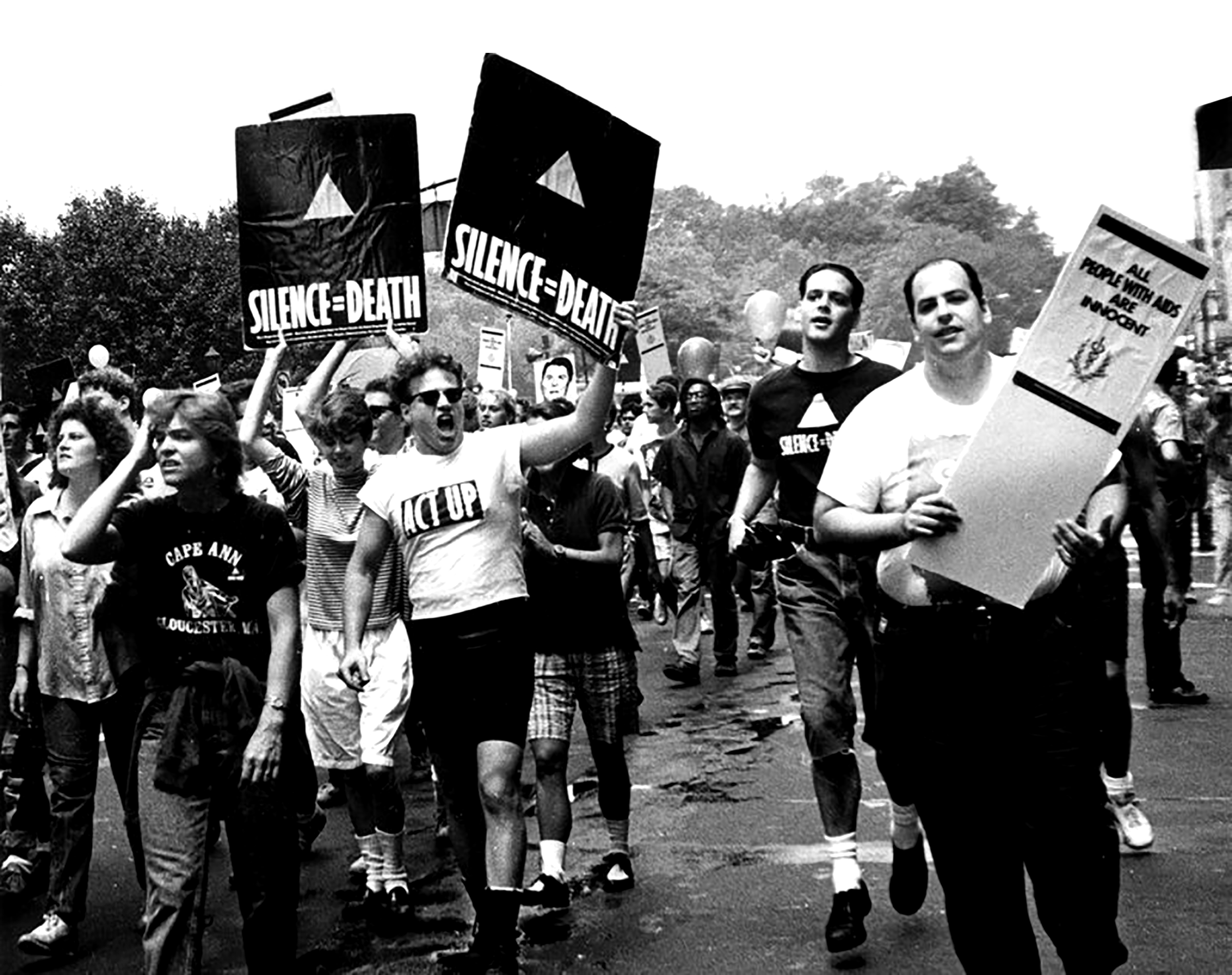
This work was commissioned to promote the theatre’s Pride month performance to local Chicago-ans and attendees engaged in Chicago’s 2019 Pride month. With this context in mind, the design was inspired by the Silence = Death Project and the activism of the ACT UP (AIDS Coalition To Unleash Power) movement.

Expanding the Narrative with Pride
This interpretation of BENT was originally cast and performed by the Northern Illinois University School of Theatre & Dance in May 2019. Led by Director Bethany Mangum-Oles, this work looked to expand the conversation on sexuality and gender norms by casting men in female roles and all women to portray Nazi guards. (above)
The Chicago Pride performance was a collaboration with Muse Theatre Collective and produced by M.F.A. candidate Daniel Kies (below left) and was again fully cast with the 2019 NIU School of Theatre & Dance M.F.A. cohort.

Inspired by AIDS Activism
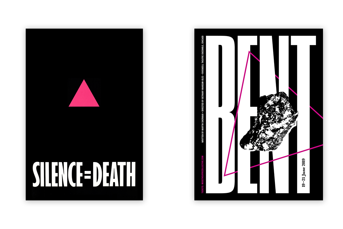
In 1987, six activists in New York formed the Silence = Death Project; the six men who created the project later joined the protest group ACT UP and offered the logo to the group, with which it remains closely identified. The pink triangle was established as a pro-gay symbol by activists in the United States during the 1970s; (below) the symbol of the pink triangle, usually turned upright rather than inverted, was a conscious attempt to transform a symbol of humiliation into one of solidarity and resistance. By the outset of the AIDS epidemic, it was well-entrenched as a symbol of gay pride and liberation.
— Extract from Encyclopedia of AIDS, via Wikimedia Commons


An Homage
The Silence = Death Project looked to reclaim the pink triangle as a source of empowerment. With the same ideology and philosophy in mind, these same formal design elements have been contextualized in a contemporary narrative. This thread of appropriation is directly related to the play’s content, but more importantly, speaks to the activism defined by advocates both past and present. The black background references the darkness of time and place, the isolation of the single prisoner and the collective cloud over society. The large title, like the interned, is tightly packed and stripped bare of individual characteristic. The long, vertical stems reference physical barriers—the separations or ideologies placed between people. The pink triangle, a symbol of oppression, represents the containment enclosing our characters. The rock (a primary and metaphoric character) represents the heaviness of burden and topic—the banality and necessity of a singular existence.
